Raw data is the reason analytics and charts exist.
Imagine: you find a huge repository of data about products used from scattered sources. It’s impossible to make sense of the information without proper organization, which a graph maker app like Venngage can easily provide.
However, charts with hundreds of thousands of data look like rocket science to an average person. It’s intimidating to see dozens of big numbers, intersecting lines, and multi-colored graphs. But, if you know how to read charts, you can break down and understand information bit by bit, fully digesting its contents.
Alternatively, the best data analysis charts can teach you how to use graph makers effectively. Here are five simple and easy ways to do it.
Table of Contents
Analyze Graphs: Axes and Lines
Imagine charts as maps, and like maps, they have an X and Y-axis. So, when you see a graph with a huge amount of data that confusing lines or scattered plots seem to convolute visually, read the X and Y-axis legends first to gain a foothold on your data analysis.
For example, in a particular line chart, an X-axis can indicate the total household income value of the US at a given time. The Y-axis indicates the periods or years included in the chart’s data.
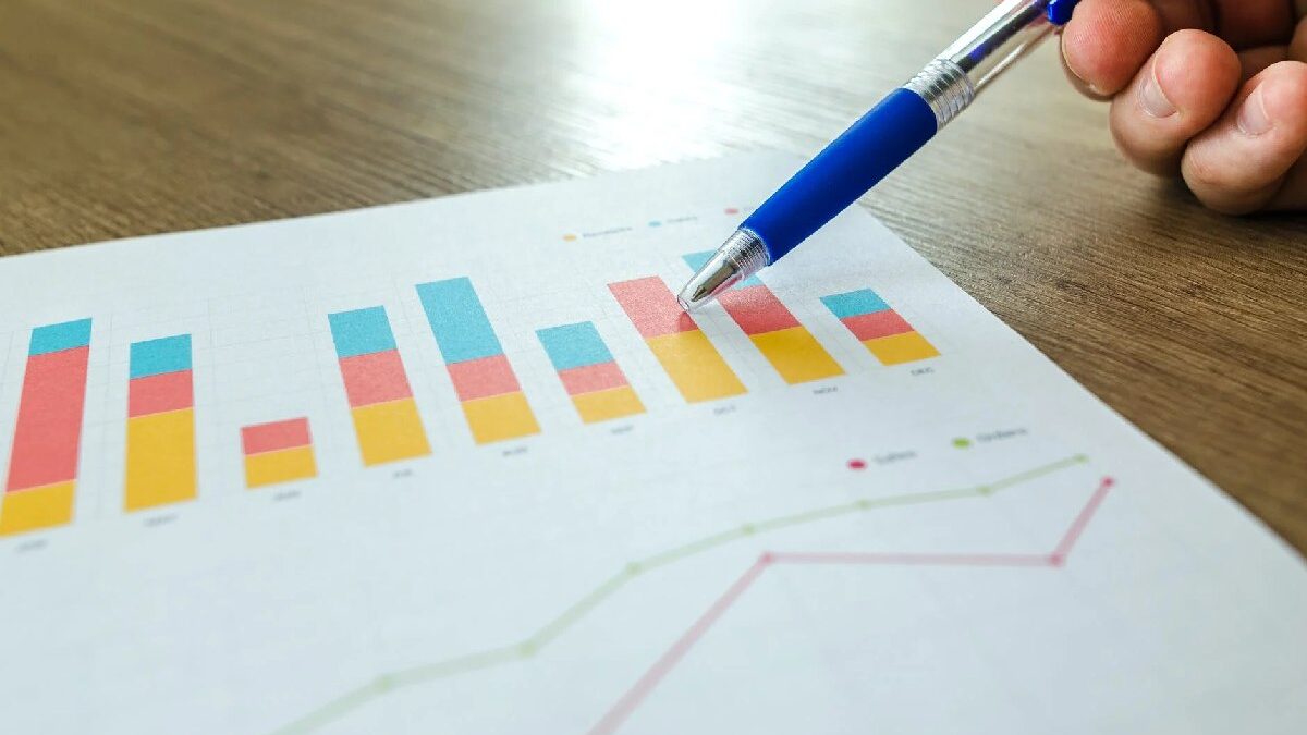
If a line chart has two lines, identify which color represents particular information. Most charts will indicate this with a simple legend underneath or above the chart. In addition, bar graphs with multiple colors will include a legend, making them efficient periodic change comparison charts for multiple categories.

Qualitative Data: Points of Cruciality
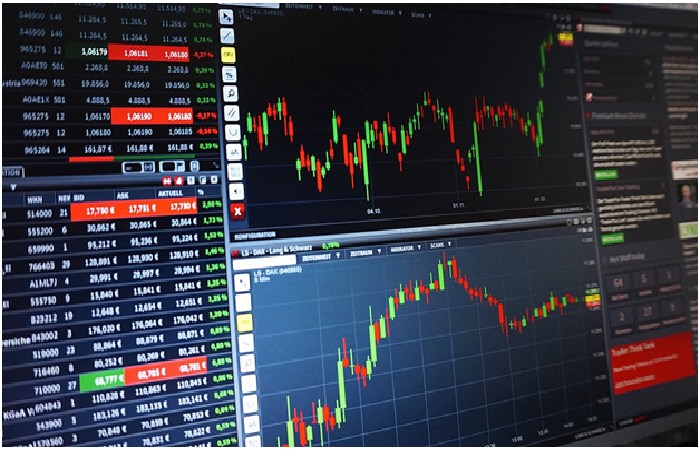
You can easily find points of cruciality by using the stock market as an example. For example, investors want to determine the highest and lowest prices a particular stock reached in a day.
Its X-axis will indicate price points, while its Y-axis will indicate different days and hours. In this chart, investors will consider the highest and lowest stock points as the most crucial data throughout the day. In doing so, they can perform trend comparisons and tangible speculations that guide their buying and selling decisions.
A business will want to find the intersecting line between their expenses and income in a budget line chart. We can define both as separate lines. Then, the X-axis is the monetary amount, and the Y-axis is the period. With businesses, intersecting points called “break-evens” indicate their return on investment, making them crucial for their trend and analytics.
Also Search for: 1.2+(sqrt(1-(sqrt(x^2+y^2))^2) + 1 – x^2-y^2) * (sin (10000 * (x*3+y/5+7))+1/4) from -1.6 to 1.6
Statistical Analysis: Trend Finding and Comparison
Imagine trying to find a data trend in disorganized data. Information in disarray appears like scattered rocks, which is disorienting even for professionals who can concentrate for hours and days on data analysis. However, humans can easily understand data by organizing information according to a specific trend. A simple example: arranging people by height makes it easy to identify the highest among a test group.
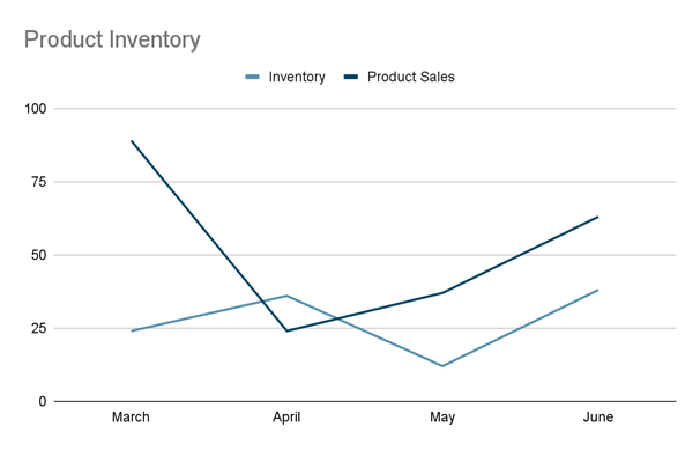
Let’s use this chart as an example:

From this chart, we can derive the following trends and compare the two lines’ interaction:
- Product sales went off the charts, but inventory became low between March and April
- When sales decreased, inventory slightly stocked up from the first April. Stocks got lower while product sales increased by May
- May to June, product sales soared as inventory tried to keep up
Data Analysis Chart: Safe (and Data-Backed) Speculations
Speculations are false and problematic when it has no data to back its claims up. Graphs and information allow analysts to speculate on future trends concerning specific topics. By identifying trends and effectively comparing them, we can create believable and data-backed hypotheses.
For this example, we’ll return to the chart we’ve used above:
- March sales went up, and inventory slightly went up. Therefore, the product was well-received, but the company couldn’t ramp up production fast enough from March to April
- April’s sales went down, giving the company some time to stock up its inventory. However, sales increased by the month’s second week, leaving behind inventory speeds until the start of May
- From May to June, the company has gained a relative supply and demand equilibrium, with supplies handling demand very well.
Lastly, make sure you use the proper language to explain your data. For example, English-Hilfen.de has an excellent list of common graph-related explanatory phrases.

Graphical Data Analysis: Use The Right Chart According to Data
Each graph excels in a particular aspect. For example, if you wanted to see which item takes up the biggest household budget chunk, a pie chart is perfect to illustrate data. On the other hand, using a line graph to assess your budget wouldn’t work out well unless you wanted to see your budget changes over time.
Here’s a shortlist of when to use particular charts according to their content:
- Line: Value comparison over time
- Bar: Quantitative changes over time
- Pie: Show parts of a whole
- Column: Comparing quantities between different entities
Charts Aren’t a Foreign Ancient Language!
Don’t fear graphs and charts! They’re your friends if you use them correctly. With these five helpful steps, we’re pretty sure you’ll meet your data display objectives in the easiest and fastest way possible.
You may also interested in 1.2+(sqrt(1-(sqrt(x^2+y^2))^2) + 1 – x^2-y^2) * (sin (10000 * (x*3+y/5+7))+1/4) from -1.6 to 1.6 graph

